When trying to craft an experience, accuracy isn't important. It can even get in the way. Often, a better overall experience can be created by misleading users. The way information is presented shapes what a user experiences, and the end user experience is more important than what the system is actually doing. Sometimes, it's ok to force the users to wait in order to teach them something.
If your web application does some processing after receiving a request from the user, an obvious thing to do is to show a loading or progress bar. The obvious solution is to show a bar that is based on the actual time it takes to process the request. Sometimes, this is ok. Other times, this assumption can lead to a worse user experience. I learned from a previous project that this can be more than just be a mistake. This assumption can damage the perception users have of the application. When creating an experience, everything must be analyzed and tailored for the app's specific use case.
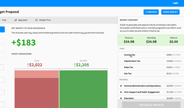
When I worked on Outline, we ran economic microsimulations to simulate public policy. In other words, we predicted financial impacts of changes to government taxes or spending. By running thousands of calculations for each person in a state, we were able to give a pretty good estimate of how you would be impacted by a cut or an increase to income tax. For instance, California has roughly 38 million residents, and a microsimuation would run thousands of calculations for each person. As you can imagine, this isn't a trivial calculation. The other systems doing what we did required expert knowledge and would take on the order of hours, or even days for some expensive calculations. We did these these calculations on the fly - whenever you dragged a slider.
This is what our final version looked like. (Read the full project case study here).
The progress bar is a lie.
As soon as you dragged a slider, we ran simulations based on your inputs, in real time, on the backend. This all took under one tenth of a second. Less than 100ms. This was how long the slowest simulations took to run. For a quick technical overview, these calculations can largely run in parallel, so I was able to use a series of GPUs (video cards) to split up the data and run the calculations. This speed came at a cost.
Initially, we thought real time updates produced the best experience. Feedback should always be instant, but not all feedback is created equally. On a technical level it was impressive that we could run these simulations without the user noticing. On a user experience level, it was terrible. For our application, it was critical the users knew we were running a simulation. Even when we showed the product to technically-versed people, the reaction was always along the lines of "this is a neat demo - how long will it take to actually implement the simulation?" Maybe it should have been obvious, but we spent a lot of time pursuing near real time microsimulations without focusing as much on the user experience.
Next, we put up a loading bar, but we had the same problem. Loading happened instantly, so the bar would only be visible for a split second. So, the loading bar was faked. Users had to click "Calculate Impact" to kick off the simulation. Even though everything was done by the time the user actually saw the loading bar, we enforced a few second manual delay. This created a much better experience. Not only that, it taught the user what we were doing. Anytime time a user was forced to wait, it was an opportunity to teach them how the system worked.
When the user sees a progress bar and numbers that go from "0 of 6 million" to "6 million of 6 million", they immediately understand that we're doing a calculation on every person in the state of Massachusetts. It's a learning experience, not just an arbitrary wait time. Not everyone understands what the system is doing, but most people get it when we show them numbers whizzing by. It's fast enough that it doesn't feel painful waiting for it to calculate; but slow enough to allow you to understand it's actually doing work. Another benefit is that we have no variance in the loading time. It always takes the same amount of time to see the results, so users develop an expectation of loading time that we always uphold.
Sometimes, faking progress is not just beneficial: faking can be critical. Any time the user has to wait for something, it is an opportunity to create an experience that teaches the user about the system. Sometimes, as strange as it seemed to me initially, the best option is to force a loading bar on the user. The user should never feel like your application is slow. But sometimes it's okay to make them wait in order to learn.